

jQuery Widgets for PC, Mobile and Touch Devices
jQWidgets 代表一個基於jQuery框架(framework)建構可在PC、觸控和行動設備上運作的網頁製作應用程式。jQWidgets 具超過30個UI widgets 。jQWidgets 不只是jQuery UI toolkit 的進化版。所有 widgets 的設計概念都是基於一個強大的共同的核心。此框架核心提供支援 widget 的擴充套件(extensions)和延續、widget 的設置、內部事件處理和進程(routing) ,性能更改通知、設備和瀏覽器兼容性的檢測和調整。
跨平台運作
jQWidgets 將 JavaScript & HTML 的 UI 界面發展到一個新的水平。它是個獨立平台、跨瀏覽器相容性,並可在PC和移動設備上運作。Don 花時間在不同的設備和瀏覽器上測試。使用可靠且基於jQuery、HTML5 和 CSS3 並與 CSS 相容的JavaScript library。此產品支援所有主要的桌上型和行動網路瀏覽器 - Internet Explorer 7.0+、Firefox 2.0+、Safari 3.0+、Opera 9.0+、 Google Chrome、IE Mobile、 Android、 Opera Mini、Mobile Safari(IPhone 和 IPad)。
jQuery 的依賴性和相容性
jQWidgets 依賴於 jQuery library。 jQWidgets 經測試並相容於所有的 jQuery 版本,我們致力於支援所有 jQuery 的新版本,並確保最高水平的品質。它是理想的企業網路應用程式和網站,可讓瀏覽者透過行動設備、電腦和舊版的瀏覽器來瀏覽。
重要:jQuery開發團隊已決定,從 jQuery V1.9.0 開始,該項目將在兩條平行的軌道發展。V1.9 * 將支援舊版的瀏覽器,而從 V2之後的版本則不支援。這意味著,如果您正尋找運用層面最廣泛的設備和瀏覽器之間的相容可能性,
您有時該使用 V2.0.0 之前的舊版。另一方面,如果您使用的是jQWidgets在行動應用程式或建立一個不在使用某些特定舊版瀏覽器的解決方案,就使用具有jQuery 2.0.0的jQWidgets。重點是要強調,保持與某些舊版瀏覽器的相容性的優缺點總是在不斷變化。如果您希望一個良好的、完善的資訊決定,我們建議您檢查近期的瀏覽器使用情況統計和分析您網站的訪客所使用的瀏覽器和設備。
卓越性能
不佔空間、高度回應,精心升級,以提供在廣泛的設備、操作系統和瀏覽器卓越的使用經驗。
主題建立器(Theme Builder)
主題建立器是一個強大的線上工具,可幫助您快速建立基於jQWidgets 的應用程式的使用者界面。
 為jQuery開發者所設計的功能強大 UI widgets
jQWidgets 提供您需要的一切,用JavaScript,HMTL5和jQuery UI來構建豐富的客戶端 UI。它包含超過30個 UI widgets,是在網路上發展最快的 JavaScript UI frameworks 之一。
適用於PC、觸控和行動設備
jQWidgets 已為廣泛的觸控和移動設備做好準備
。框架(framework)自動偵測設備類型、相容性和瀏覽器的版本,並調整為最佳渲染(optimal rendering)的內部行為和最佳的用戶經驗。該框架支援所有主要的桌上和行動網路瀏覽器 - Internet Explorer 7.0+、Firefox 2.0+、Safari 3.0+、Opera 9.0+、 Google Chrome、IE Mobile、 Android、 Opera Mini、Mobile Safari(IPhone 和 IPad)。
高品質的標準
大多數JavaScript和jQuery widgets 並不相互整合。他們往往缺少的功能,包含 bugs 和需要大量的時間來適當地融入一個真實的項目。相比之下,jQWidgets提供專業的開發經驗,並配備完整又無縫接軌的 widgets ,還提供一致的、高品質的外觀和介面。所有的 widgets 需再多個設備和瀏覽器上進行測試,以確保最大的相容性。
強大的框架(framework)、獨特的功能
jQWidgets 不只是 jQuery UItoolkit 的修改版本。jQWidgets 不只是jQuery UI toolkit 的進化版。所有 widgets 的設計概念都是基於一個強大的共同的核心。此框架核心提供支援 widget 的擴充套件(extensions)和延續、widget 的設置、內部事件處理和進程(routing) ,性能更改通知、設備和瀏覽器兼容性的檢測和調整。
優化性能
jQWidgets著重於性能表現。它體積小、高度模塊化(modular)和可擴展的。個別 widgets 和主題可按照您的需求加載,同時進一步優化了下載時間和節省您的記憶體。所有的 widgets 可依照在智慧型手機、平板和電腦所運行的不同系統和瀏覽器進行最佳用戶經驗優化。
Web Demos
Introduction
jQWidgets is a comprehensive and innovative widget library built on top of the jQuery JavaScript Library. It empowers developers to deliver professional, cross-browser compatible web applications, while significantly minimizing their development time. jQWidgets contains more than 60 UI widgets and is one of the fastest growing JavaScript UI frameworks on the Web.
Highlights
- Feature complete UI widgets.
- Works on PC, Touch and Mobile Devices.
- Rich functionality and great performance.
- Angular 13 Components.
- Vue Components.
- Blazor Components
- React JS and React TSX Components.
- AngularJS Directives.
- Custom Elements.
- Typescript Definitions.
- ASP .NET and ASP .NET MVC integration and how-to demos.
- Java integration and how-to demos.
- PHP integration and how-to demos.
- PhoneGap Integration.
- Wordpress and Joomla Integration.
- 60+ UI widgets, 30+ Charts, 1200+ code samples are provided to accelerate your learning.
- Search-engine friendly.
- Guaranteed 24h support time for licensed developers Mon-Fri.
- Outstanding technical assistance provided by software developers.
- Free fully functional Download and upgrades for a full calendar year.
- Chart Studio - cloud solution for visual editing and hosting of interactive charts.
- jsEditor - cloud solution for JavaScript, HTML and CSS editing, hosting and sharing your web development ideas.
- Easy CSS styling and online Theme Builder tool.
- Ready to use, built-in Themes.
- Unique and completely customizable architecture for JQuery widgets.
- Integration tutorials for Bootstrap, RequireJS, BreezeJS, KnockoutJS.
- AngularJS, jQuery Mobile, WordPress, Joomla and more.
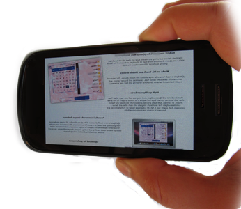
 Works on PC, Touch and Mobile Devices
jQWidgets takes the JavaScript & HTML UI development to a new level. It is platform independent, cross-browser compatible and works on PC and mobile devices. With jQWidgets, you can target new devices such as tablets and smartphones by using the extensive range of touch enabled jQuery Widgets. The jQWidgets framework automatically detects the device type, capabilities and browser version, and adjusts the internal behavior for optimal rendering and best user experience.
Optimized for performance
jQWidgets is built with performance in mind. It is small in size, highly modular and extensible. Individual widgets and themes can be loaded on demand to further optimize the download time and save memory. All widgets are optimized for optimal user experience on smart phones, tablets and PCs running different operating systems and browsers.
P owerful framework. Unique features.
jQWidgets is not a modified version of the jQuery UI toolkit. All widgets are designed from ground-up and based on a powerful common core. The framework core provides fundamental capabilities like support for widget extensions and inheritance, widget settings, internal event handling and routing, property change notifications, device and browser compatibility detection and adjustments.
High quality standards
Most JavaScript and jQuery widgets don’t integrate well with each other. They often lack features, contain bugs and require a lot time to properly fit into a real project. In contrast, jQWidgets provides professionally developed and feature complete widgets that seamlessly integrate with each other and deliver a consistent, high quality look & feel. All widgets are tested on multiple devices and browsers to ensure maximum compatibility.
Browser Support & Mobile Device Compatibility
 jQWidgets is ready for a wide range of touch and mobile devices. The framework automatically detects the device type, capabilities and browser version, and adjusts the internal behavior for optimal rendering and best user experience. The product supports all major desktop and mobile web browsers - Internet Explorer 7.0+, Firefox 2.0+, Safari 3.0+, Opera 9.0+, Google Chrome, IE Mobile, Android, Opera Mobile, Mobile Safari(IPhone, IPad).
 Easy to Use
Browse over 1200 online demos of our Web UI widgets. All demos come with full source code and are presented in multiple different themes. If you want to build your own theme, you can use our Theme Builder. Our widgets feature intuitive API and come with getting started documentation. If you have a question, please feel free to contact us at [email protected], [email protected] or [email protected]. We offer free support from Monday-Friday during your 30-days evaluation period.
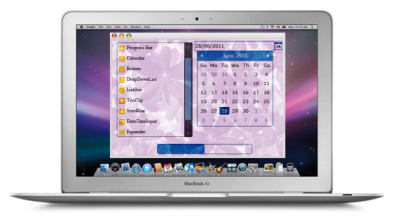
 Theme Builder
jQWidgets comes with multiple built-in and cross-browser compatible themes. They are everything you need to build awesome-looking applications with consistent look and feel. To help you build new themes, we have developed a Theme Builder tool.
 Roadmap
jQWidgets is evolving quickly. Our development schedule is very aggressive and we are committed to equip you with the best tools for HTML5, JavaScript and jQuery User Interface development. We aim to respond quickly to your requests, and to adapt our plans to optimize quality. Based on customer feedback and demands, we may prioritize the development of new features and new widgets. The plan for the next 3 months can be found here: Roadmap. jQWidgets also offers the most aggressive release schedule in the industry with four major releases guaranteed per year.
The commercial license is suitable for commercial websites and projects or a corporate intranet. The license allows royalty free distribution with your websites and applications. Each license includes 1-year subscription for free product updates and premium or standard technical support plan.
Website License
- For 1 developer and
- 1 project
- Perpetual and royalty free
- No Source Code
- Standard Support
- Includes all jQWidgets UI widgets, technical support and updates to newer versions for 1 year
- jQWidgets for Angular
- jQWidgets for React
- jQWidgets for Vue
- jQWidgets for jQuery
Developer License
- For 1 developer and unlimited number of projects
- Perpetual and royalty free
- Source code
- Premium Support
- Includes all jQWidgets and Smart UI widgets, technical support and updates to newer versions for 1 year
- jQWidgets for Angular
- jQWidgets for React
- jQWidgets for Vue
- jQWidgets for ASP .NET
- jQWidgets for jQuery
- jQWidgets for Blazor
- Smart UI
Team License
- For 5+ developers and unlimited number of projects
- Perpetual and royalty free
- Source code
- Platinum Support
- Includes all jQWidgets and Smart UI widgets, technical support and updates to newer versions for 1 year
- jQWidgets for Angular
- jQWidgets for React
- jQWidgets for Vue
- jQWidgets for ASP .NET
- jQWidgets for jQuery
- jQWidgets for Blazor
- Smart UI